


Here is an example of some prototype blue cards from the Robbers' Roost expansion with a Barrel from the original game to the left of them as a comparison.
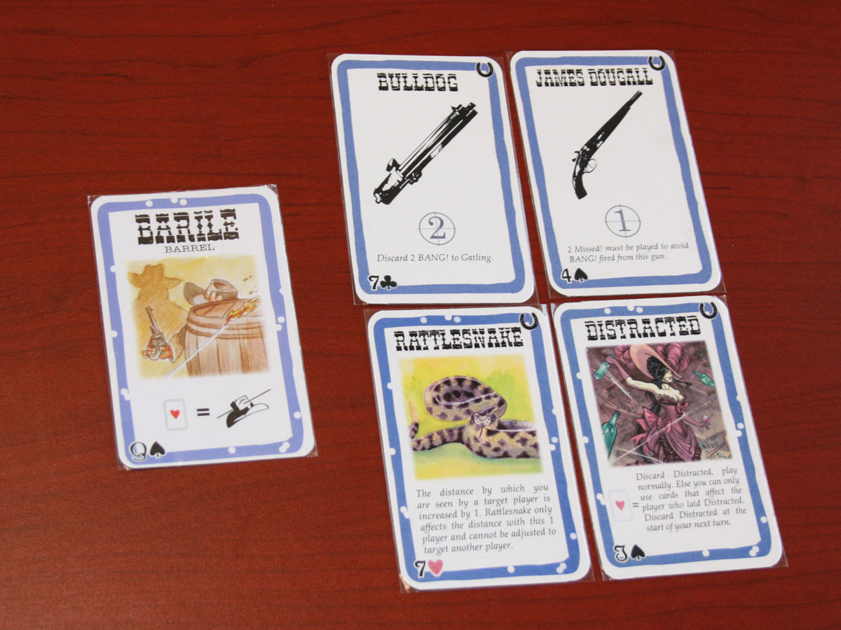
You should notice some things right off. First, the blue border in my prototype cards is a little darker, but this isn't that important. The titles are much smaller on my cards, since I poorly assumed that the font size for the character cards was equivalent to the font size of the playing cards. I didn't recognize this problem until after I had printed the cards. Silly me. I have fixed this since, as you can tell in the card sheets I have realeased. To deal with the bigger font size on the playing cards, I also had to hack the text descriptions, which I think ended up being a good thing. The font for the card values in the left hand corner I never could identify, but I tried to find a similar scripty font. However, one playtester for Death Mesa said he had trouble reading the values in this font, so I changed to a more legible Microsoft Himalaya font. That is used in both the Death Mesa POD, and in the Robbers' Roost cardsheets now. Matching the colors for the backs ended up being more problematic:

While not terribly off, the woodgrain between the original card (the 3rd in the row) and the Robbers' Roost prototypes in clearly different. The discerning player could tell if a card on top of the deck was a Robbers' Roost card or not in good lighting. This could/could not be so bad, as that means he knows that it is one of 56 new cards in the deck, but since some of those cards are from the original game (BANG!, Missed!, Beer, etc. to balance out), he cannot infer too much. One way of dealing with the color management issue was for me to make the orange cards necessarily placed in front of other players. That way everyone would know that it is an orange card from the expansion anyway, so it undercuts that discerning knowledge.
Now for some tan and orange cards:


Nothing really new to explain about these cards beyond what I said about the blue cards. I apologize for the blurry/darker picture of the orange cards. Of note, I renamed "Old Nag" to "Wild Stallion" (tribute to Bill & Ted), and the values of these tan and orange cards I have mostly changed.
As for character cards:

Fanny Porter, the second character in the row (and now Maggie Mae in the official release), is the prototype character. Gary Looter from WWS is on her left, Uncle Will from the Bullet on her right, and Paul Regret from the original game is at the far right. I placed these characters in a row to show some of BANG!'s own variance in color throughout the expansions. Paul Regret's border is clearer the darkest, with Uncle Will lightening up some more, and Fanny Porter and Gary Looter are nearly the same hue. These borders have a lot more flux in them. Character images too: Uncle Will is far lighter than Gary or Paul, with Fanny somewhere in between. The strokes on Fanny Porter have a more magenta tint however. The font sizes are correct across the board. In terms of text, both use Palatino Linotype, but Fanny only includes an English description (also italicized as in the others). As for the backs:

The colors are closer here, but again the woodgrain is off, having more of a magenta than orangey tone to it. Getting this back right is less problematic for gameplay as the characters are all dealt at the beginning of the game. Nonetheless, it is aesthetically pleasing to get things as close as you can.
I hope this gives you a good feel for the custom cards you can make using the plaincards.com templates and your own printing/cutting tools. Mod on!
wow....amazing they look so close to the original!
ReplyDeleteKevin
Hi Marty, our friends and I are quite crazy for Bang. Thus I was eager to find this gorgeous expansion of your. We would like to try your expansion and sent the access request to your gdrive. I hope you will kindly accept my request ><
ReplyDeleteThanks a lot!!!!